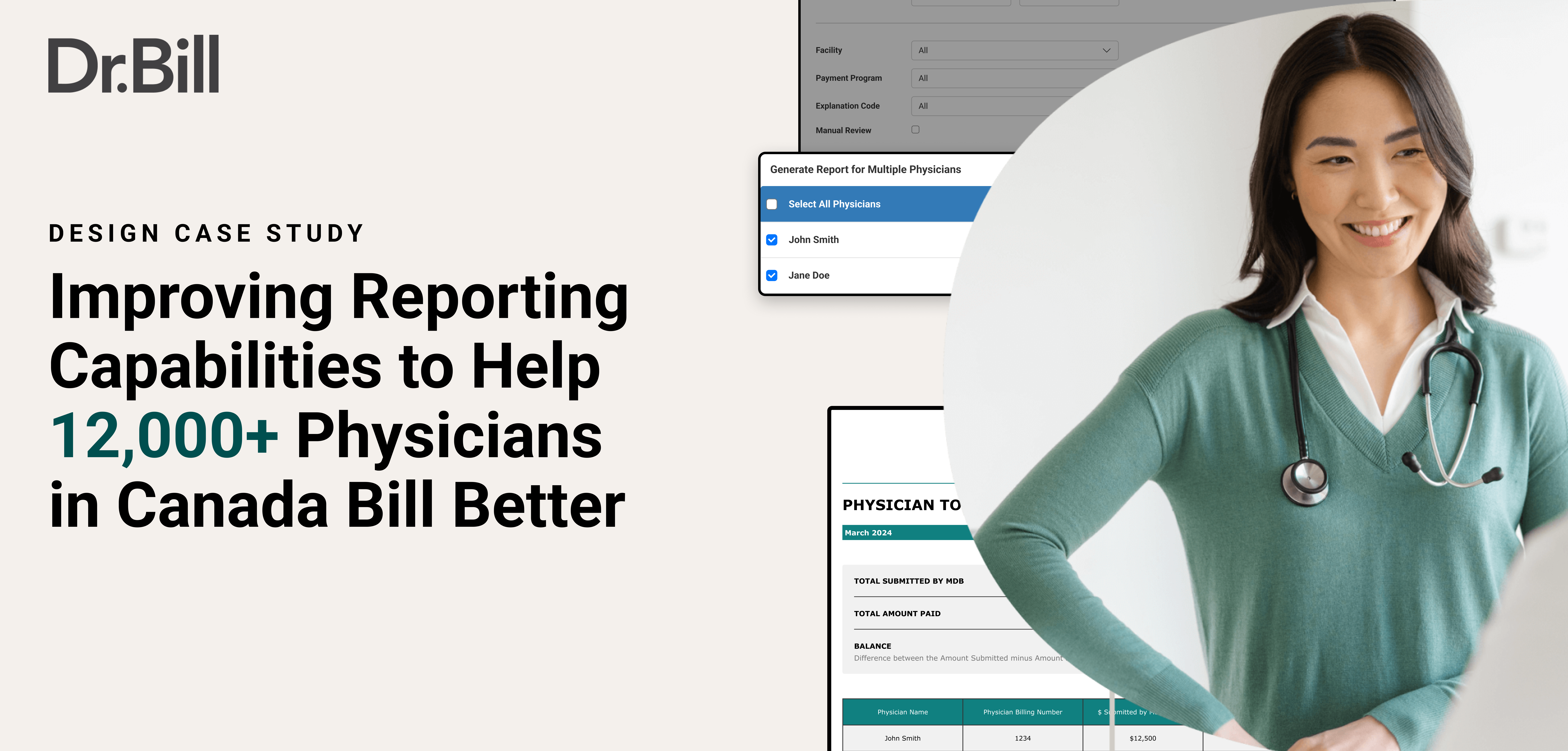
In Canada, physicians bill the government to get paid for their services. Enterprise clients (hospital departments & billing groups) rely heavily on reporting to understand what was billed, what got paid, and where discrepancies exist. In short, better reporting capabilities = more time saved for physicians. At Dr. Bill, I helped redesign the reporting experience, and led the end-to-end redesign of the Claim Summary Payment report - one of the most frequently used enterprise reports after uncovering critical inefficiencies that caused hospital leads and billing agents to spend unnecessary hours reconciling payments.
This redesign aimed to give physicians and hospital leads clarity and control, and to support the company’s enterprise north-star of $1.5B in gross billings over 5 years. Most importantly, it aimed to help them save their valuable time. (Fun fact: when I shadowed emergency department physicians at Health Sciences North in Sudbury, I learnt they spent a whopping 30-40 minutes daily just billing!)
Duration
January 2024 - August 2025
Tools Used
Figma, Figjam, Google Analytics, Mixpanel, Jira
📍 Canada (Ontario, British Columbia & Alberta)
1. The Problem
CONTEXT
At Dr. Bill, one of our key target markets were enterprise groups, which included hospital groups and clinics. Our guiding principle for the enterprise 2025 product roadmap was to ‘Reduce pain & increase efficiency for groups at scale’. This served as my ‘high level’ story to ground myself when making design decisions for this set of users.
WHY TACKLE REPORTING?
With this context in mind, and through user engagements over a period of time, our reporting feature was identified as one of our ‘big bet’ areas to spend time and resources on. Despite being mission-critical, reporting had grown organically and was built engineer-first, not design-first. This was evident through the
a) The limited type of reports offered
b) The lack of appropriate filter options within the reports, and
c) The overall experience of pulling a report from the dashboard
The reporting experience was also important to tackle because of its value to physicians and to hospital groups. It directly affects
1. How much confidence physicians feel in managing their finances.
2. How much time they save whilst trying to get key information relating to their finances.
3. And ultimately, retention with the Dr. Bill product.
I identified the following key user story as we began our exploration:
Hospital leads want ease and efficiency so they can manage payments for multiple physicians better.
CURRENT STATE
Before solutioning, I mapped the entire reporting ecosystem across our three main user groups:
1. Associated users (essentially department heads)
2. Billing agents (Dr. Bill/MDBilling.ca staff that help clients with their billings)
3. Physicians.
I also highlighted the various reports used, the filters available currently for each of them, which province they are available in, and whether they are shown in the ‘basic’ or ‘advanced’ reports section on MDBilling.ca. The aim was to create a birds eye view before we began solutioning.
There were two dominant use cases that emerged here:
a) When group leads received their remittances (a report that advices them what they were paid by the government), and the amount matched what they had billed - users wanted to see how much revenue each physician billed and receieved.
b) And, more importantly - when a group lead received their remittances, and the amount did not match what they had billed - they wanted to see the rejections, adjustments & unprocessed claims.
2. Exploration
IDENTIFYING PAIN POINTS
Led by the Product Manager on this project, we began to identify more granular issues that users and our team had previously highlighted with the entire reporting experience.
KEY INSIGHTS
I sorted these pain points into three distinctive categories as follows, and defined user stories as to the value that solving them can bring.
1. Users needed better filtering - At the moment, physician leads would have to pull a report individually for every single physician under their group, because there was no ability to filter physicians within a group. They were also not able to filter medical claims based on the claim status, and the explanation code for a rejection.
2. The reporting experience was not user friendly - There were simply too many report sections - basic, advanced, generate reports, which confused users. There were also no explanations for any report, and users would have to find out what they do by pulling them.
3. Report layout made it hard to identify key information - This had to do with the layout of the actual claim summary report. Key data was all the way at the bottom, explanation codes were hard to identify, and report summaries were unclear.
ASSUMPTIONS & SCOPING
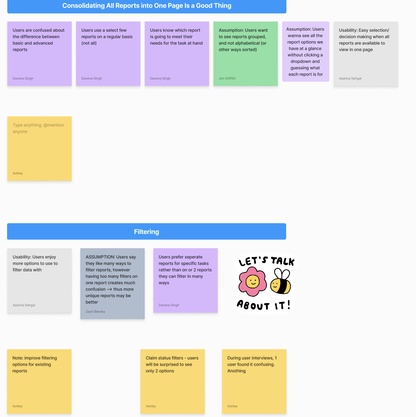
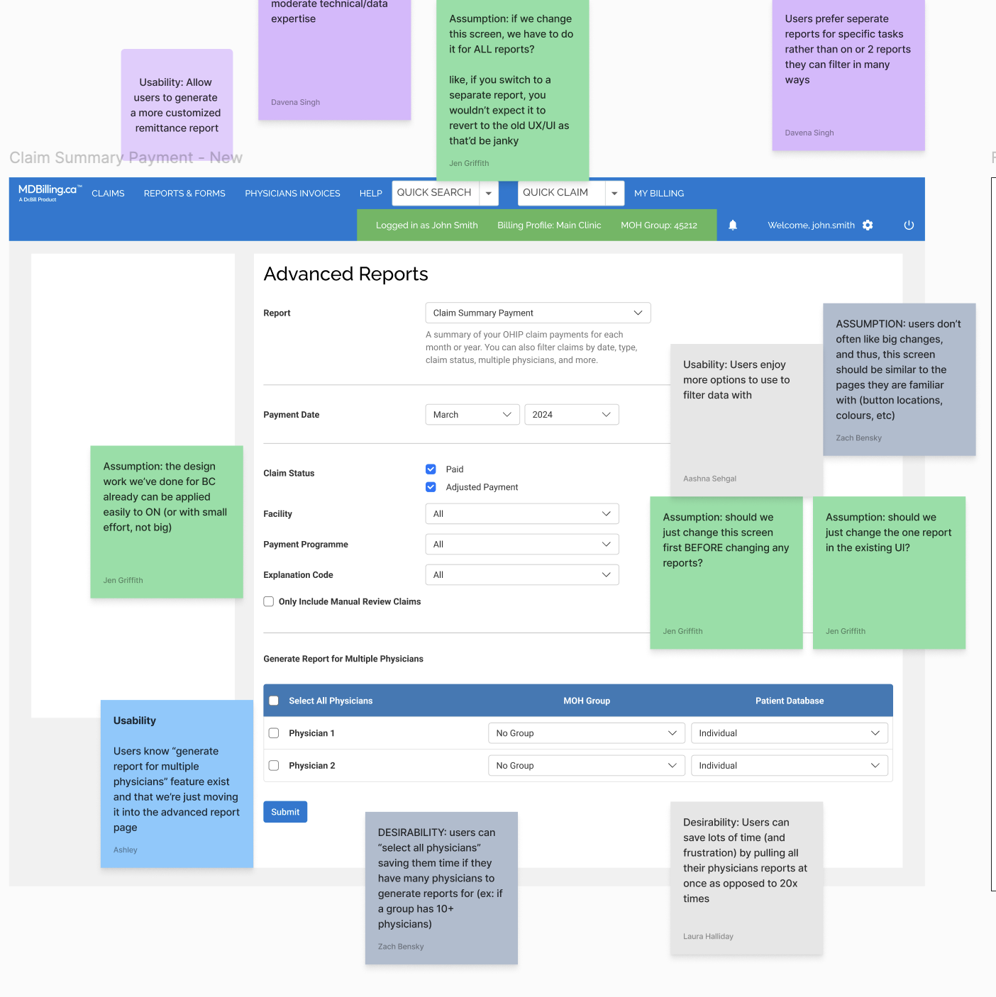
With a first set of designs ready, I wanted to run an assumption mapping exercise with the product managers and the tech lead. The purpose was simple - to voice any assumptions we are making (consciously or otherwise) while solutioning. An example of this was the assumption that more filters was a good thing. Some of us were of the opinion that users think they want more filters but would actually find it overwhelming, and some thought more is more. These assumptions were good to flag before we began testing our designs with users.


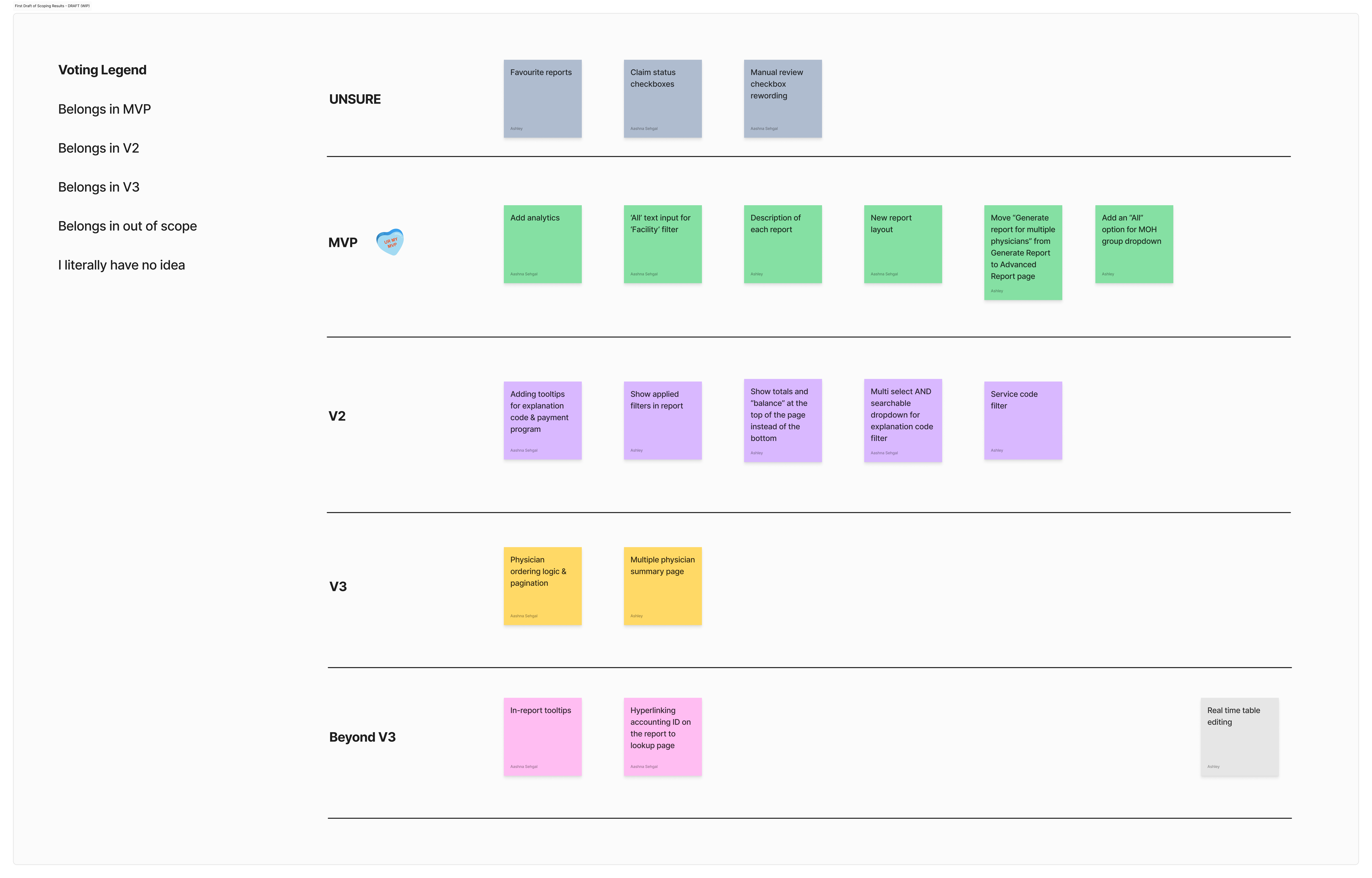
Aditionally, since there were 60+ initial issues highlighted, I wanted to run a scoping exercise to decide what was ‘top of mind’ to solve for in the MVP, and what should be prioritised in V1, V2 etc.

